Test of Android version 6.0.x
-
242 Comments sorted by
-
Actually offline, oneline search cannot recognize what's town and what's street. It is testing every word combination.If @stepan tries to do it I would recommend after search to check if there are results and if not then try to delete any number containing 5 digits and run the search again (the second search would be fast because the search tree caches are still valid).
-
6.0.127- crash when not signed in to google account fix- new vehicle manager- white theme color in choose color scheme list fixThere are some missing translation, any help is welcome (French at least)... Thank a lot :-)
-
When opening the new vehicle manager, the strings under the big symbols at the top are not translated (while everything else is).The untranslated string is taken from the "Name" in the white section below. You could pre-set it with the vehicle type. It is already translated.
-
6.0.127
+) Starting the app with deactivated "Google Play Store" ( = not signed in to Google account ) now works, so my #1 No-Go is resolved
+) I found a way to avoid incorrect routings (like the Stockholm-Dresden error) by manually editing the vehicle_profiles.xml file which was my #2 No-Go
-) I found no way to delete a profile in the new vehicle manager
-) the autozoom in software rendering mode still differs from the other rendering modes -
6.0.130- delete vehicle from vehicles manager missing functionality re-added- My routes items not sorted alphabetically fix- My routes drag&drop bug fix- occasional empty maps to purchase list when shop started earlier than fully initialized bug fix- info panel visualization minor tweakmany thanks for new translations :-)
-
@lubos Ahoj Luboši, očekával bych jistou dávku loajality a konstruktivní kritiky k aplikaci namísto jednohvězdičkové recenze na Google Play. Pokud bys konkrétně nastínil, co se Ti nelíbí, určitě bychom to ocenili více. Díky. Zdraví ten, kdo navrhl "crazy menu structure".Hi Luboš, I would expect a certain amount of loyalty and constructive criticism instead of a one-star review on Google Play. If you specifically outlined what you don't like, we would definitely appreciate it more. Thanks. Greeting from "crazy menu structure" designer.
-
Hi @filips, I deleted the 1 star rating, I was today morning too critical to everyone. Sorry for that.
However my personal problem is only with the main menu and tools. All other screen are well done.
* Using very similar icon for more operations is not optimal (settings vs select search engine)
* I would not search for Map Manager under tools (by tools I understand additional functionality but not functionality which is necessary to use the app)
* for the multiline search I have a problem with the tabs on the middle of the screen (tabs should be always on the bottom or on the top of the screen)
* I do not understand why multiline search does not show the search history and oneline search show the search history if the query is empty (it does not feel consistent). How to get search history in multiline search?
* The action buttons on the main screen are in a three different styles (maybe it would be better to put there map manager back and keep just two styles of action buttons)
One more sorry, if I hurt you by my criticism
-
Hi,Version 6.0.131- Same bug April 17 - No blue panel displayed for the name of the ramp and roundabout exits.- No option opacity for navigation E-Ink screen.- Format of icons in 3D navigation too small compared to 2D.This problem has been present for a long time, you should put 2 icon format settings, 2D format and 3D format.This would correct the problem.
-
Hi,
I've some questions before trying,
Is this link http://download.mapfactor.com/mapfactor_navigator.apk updated ?
If yes, I supposed it's the best way to download the las version 6.0.131 ?
Do the install of 6.0.131 erase the 5,x ?
-
Hi,
The calculation of an alternative route should not be done in case of multiple waypoints in the list.
Or by asking the question: alternative routes yes / no?
Because it takes a long time to calculate for nothing.
We don't always think of deactivating alternative paths each time when we load a Gpx file.
-
Hi,for the bug April 17 No bue panel displayed :On a road with several roundabouts, only the first blue direction sign is displayed.All other roundabout exits are not displayed.You can simulate this route with 3 roundabouts several kilometers apart and an exit ramp which is not also displayed:Departure: 47.1838044, -0.2461561Arrival: 47.2552247, -0.3321592Thx.
-
I tried the 6 version a little, but I don't like the changes for my use.
I would have been able to maintain the 5 version, but the install of the 6 version erased the 5 as an update. I guess it is an update, it would be nice to still have the former version to switch back.
How could I proceed if I want to go back to the 5 (105) ? I'm trying to use the 6, but I'm not very satisfied for now. Without loose my datas.
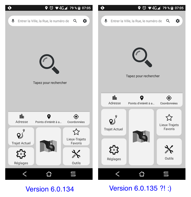
The search menu is too big, I don't use it often, a simple search icon was good enough as for others icons.
On a motorcycle with that display I have small icons, the ones I use at the bottom, not cool.
Same remark for the vehicule manager, I prefer see all the vehicule profiles to choose one than to horizontal scrolling. Then I would be able to hide the profiles I don't use like Truck, Motorhome (managed as the truck), cycle, and pedestrian.
More, the vehicule profiles are'nt sorted (A-Z) and I can't find the expert mode by a long press on the screen to modify some parameters and avoid weird calculations. (Expansion limit, etc.).
The dynamic shortcuts doesn't work, if I long press on an icon it's the way to moove that icon on the screen(s).
Except the new zoom I'm not good with that 6 version, sorry.
-
I am sorry to say but I agree with @madbiker7 comments regarding v6.
You have complicated instead of simplifying the user interface. More difficult to find and use things .
I am trying hard to get used to it - it shouldn't be so...
Please do pay attention to his comments... -
@tomas
Just a couple of examples
Load a route.
In v5 you see the waypoints with a clear panel of choices at the bottom.
In v6 are not there. Luckily I notice the 3 dots at the top.
A simple one tap changed to two taps.
What is the benefit for the change?
Vehicle profiles.
I have created different versions of my motorcycle profiles and could switch over very quickly.
I took me some time to realize that are now scrolling.
It looks flashing and more likely now using more resources.
What's the benefit of that?
To me the less steps to find something the better. Not very keen on menus with submenus.
And finally ...
As for the main screen...the search area has taken over ... it looks strange and out of place.
Just my opinion -
I imagine that @stavrich and me we found difficult to change our habits. The user interface with big icons are easier to read and press whatever the icon you need.
Now, launching Mapfactor gives too much place for the search plus the Navigate button. The remaining icons are smaller and at the bottom.
I understand the hard work for developers to realize that, it's a choice, a bet ?
For now I decided to give a chance to v6 because it's the only way to get future evolutions of that soft. I suppose that v5-105 will not have improvements.
-
@Tomas the @stavrich answer was for me I guess ;-)
Thank you, I tried, it works the way you said. Is there a way to get the expert mode with long press for access to Expansion limit etc. ?
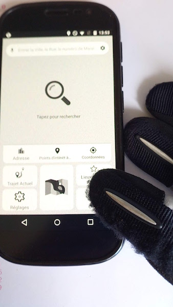
Thank you too @MacDony an other old school biker. When I'm on my bike I have a stylet attached with a cord because my gloves don't work on the screen. Anyway the bottom of the screen is not cool to press near the tank bag.
In my 4 wheel collector things are differents, but the size of icons needs me to get closer to the screen. I don't wear glasses for now, that's my limit, I still have a good eye sight.
-
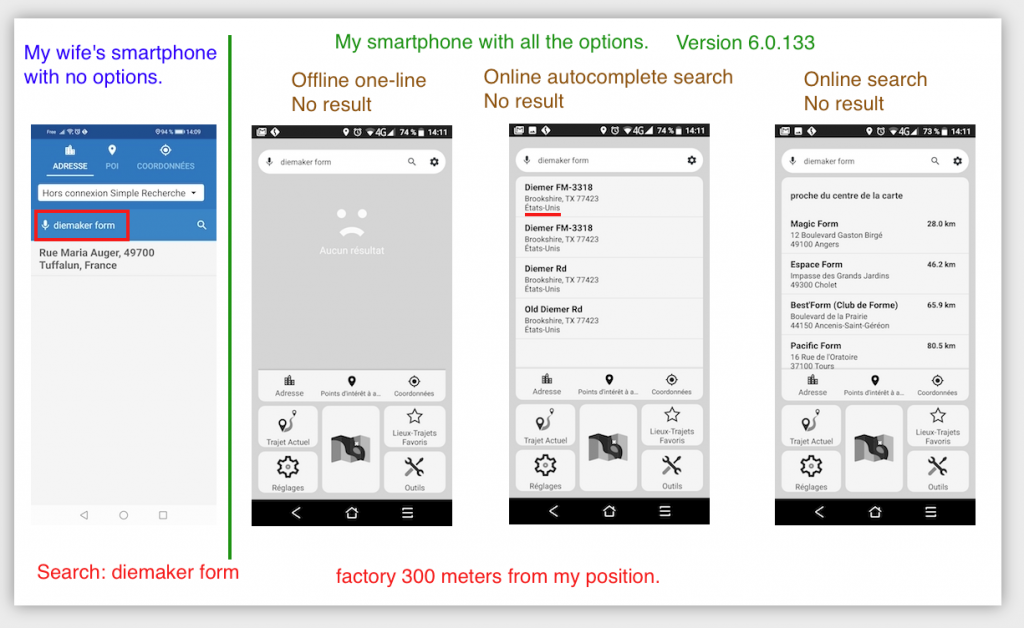
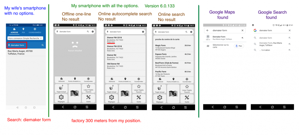
Yes, you're right Tomas, my wife has version 5.She has no options and finds "diemaker form" in seconds.So,Navigator version 5 finds "diemaker form"Maps finds "diemaker form"Google finds "diemaker form"Waze finds "diemaker form"Osmand finds "diemaker form"I have Navigator version 6, paid for all the options and Navigator V6 can't find "diemaker form".there is not a problem ?!
-
Tomas,I don't understand, online search (paid) is not Google search as in the old versions ?!It must be said what is the paid search engine.You don't have to pay and then find out that it's not google search and also that it's an annual subscription.Nothing is indicated in the Premium section.Can't we look for anything other than the categories imported into Navigator ?!If I have an appointment in a factory for work, Navigator will not find the factory !?I am surprised for a Gps as efficient as Navigator to be limited ..... even when paying.Denis.
Howdy, Stranger!
It looks like you're new here. If you want to get involved, click one of these buttons!
Categories
- All Discussions3,265
- Feature Requests1,276
- Bugs558
- General378
- Navigator FREE1,031
- Vehicle Tracking5
- Navigator 1017
In this Discussion
- 2highlander December 2020
- Brucie76 June 2020
- chattiewoman July 2020
- Delfin May 2020
- dirkn June 2020
- Durko July 2020
- dzidek23 May 2020
- filips June 2020
- hvdwolf May 2020
- JambaFee September 2020
- jd417 July 2020
- lubos September 2020
- MacDony November 2020
- Madbiker7 September 2020
- Matthias September 2020
- mes September 2020
- mkz May 2020
- Oldie June 2020
- rab May 2020
- Roldorf April 2020
- Rollmops67 November 2020
- stavrich October 2020
- stepan November 2020
- tomas September 2020


