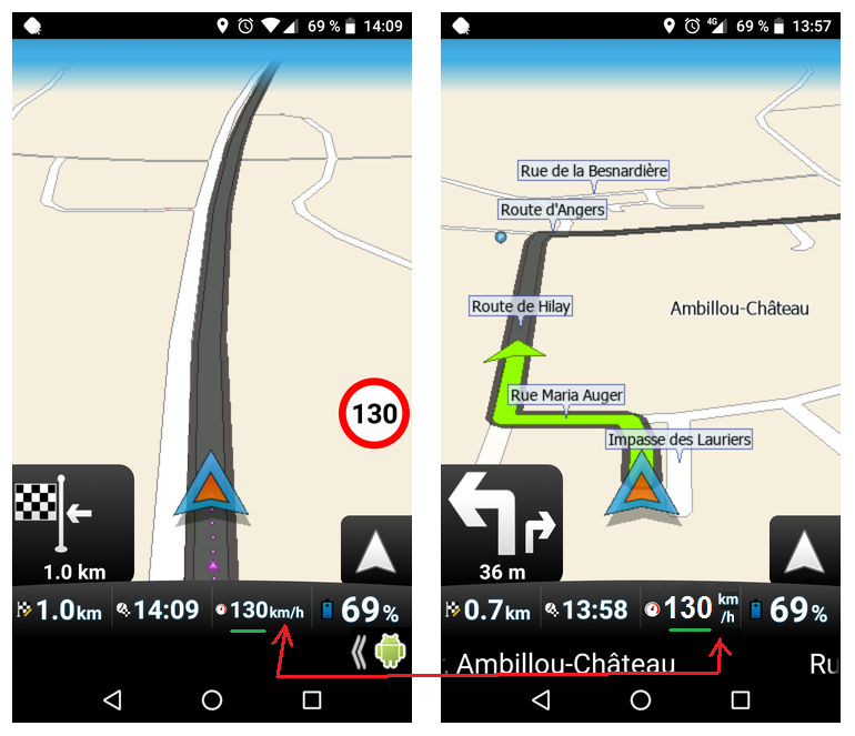
Speed Size
-
Hi all,
Is it possible to put "km / h" in 2 parts to increase the size of the speed.
-
8 Comments sorted by
-
Isn't there a speedometer on your dashboard ??? ...
-
Of course,click on the dashboard, add and select what you want ...
-
I think steiny meant your car's speedo.... ;)
-
I ride on Motorcycles Victory Cross Country Tour.
-
OK, bike dashboard then, but still don't know one without speedo.
-
Haaa, ok!I now understand the question ...So as a reminder, Beta testers are there to report errors in the application and underwrite any improvements.Whether on the operation or on the visual.We are Beta Tester for Navigator to become a quality app.It is already a very powerful application.If there is a speedometer in Navigator, it is because it has been requested and approved.The question "you do not have one in your car" has no place to be.
-
I fear I still don't understand the problem. There has always been a speedo in MFN and you can see it by default. But the speedo I'm always looking at when driving is the one of my vehicle.
If I would use MFN's speedo only you're right in principle, but even if with Your suggested line break it would still be way too small. My favorite size then would be the same as those of the radar warnings and if so they must be kicked out of the standard field and shown as an overlay on the card, somewhere near the border, combined with a possibility in MFN settings to switch it off for those users moaning about cluttered cards.
BTW, You know that the size of the info panel can be changed...? And when deleting fields you do not need they even grow bigger. I'm always using MFN in landscape format and never felt the need to break the km/h line, even with the max number of fields. -
Yes, I know that the size can be changed, but the position of the navigation arrow does not go up the value of the size change, which hides some of the navigation when you turn left.But, you're right, if the speedometer was optional on the screen, it would be better.I already suggest its position in the icon 3 positions, but I can not find the topic.
Howdy, Stranger!
It looks like you're new here. If you want to get involved, click one of these buttons!
Categories
- All Discussions3,264
- Feature Requests1,275
- Bugs558
- General378
- Navigator FREE1,031
- Vehicle Tracking5
- Navigator 1017
In this Discussion
- 2highlander January 2019
- MacDony January 2019
- steiny180 January 2019