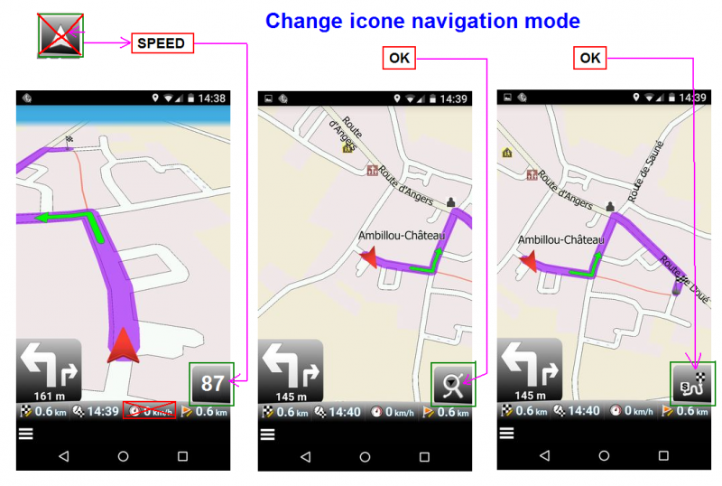
Change Icone navigation mode
-
5 Comments sorted by
-
That one is still relatively small. The implementation I saw in Navmii is nice as well.
-
Great idea to put the actual speed in that button- saves space!
So I make a +1 to the counter! Because it doesn`t work at the moment.
But also, the two other following buttons as shown in the pictures from MacDony (who cycles through the views) should be improved:- The button always show the present view. It should show the next view- i.e. what happens if you press it. Because: Like it is now, it`s confusing.
- When you navigate and select the second map view style, the
non-3D-detailed one, the map section does not move while driving – so
your position moves out of the map very soon. Therefore I could not find
any use of this view style. - There should be a fourth cycle with zoom level inbetween the second and the third. Or, even much better: The zoom levels in the cycles should be configurable. Or make the zoom level in the second cycle smaller. Because: The zoom level in the second cycle is too big for me.
- The button always show the present view. It should show the next view- i.e. what happens if you press it. Because: Like it is now, it`s confusing.
Howdy, Stranger!
It looks like you're new here. If you want to get involved, click one of these buttons!
Categories
- All Discussions3,266
- Feature Requests1,276
- Bugs559
- General378
- Navigator FREE1,031
- Vehicle Tracking5
- Navigator 1017
